
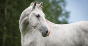
Gastro Pellet: Stomach Well-being Starts in the Mind
Anyone who spends every day around horses knows it well:…
Feed and products in 25kg bags excluded
Bank transfer | Paypal | Credit cards

![]()
A company logo: a story of values. When you talk about a company logo, you unfold the story of that company’s values. Behind the evolution of a logo, there’s much more than changing its graphic design and making it look nicer: there’s the evolution of a company, of its values and its goals. Because logos tell us stories: the stories of the companies to which they belong. Its logo is the most direct and immediate way a company has to share its vision.
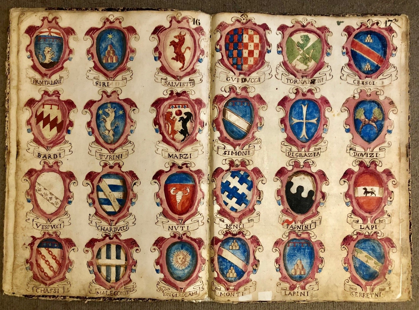
Which is the first logo ever created? First logos in history date back to Greeks and religious symbols. But the very first brand logos – if we may define them so – were coats of arms. Indeed, they used to tell the story of an eminent family through symbols, which were now stylised, now quite complex. And even coats of arms could go through aesthetic changes to keep up with the history of the family to which they belonged. Modifying a logo is no big deal.
But its main typographic elements and the values it represents need to stay the same. For example, Coca-Cola has changed both its product’s formula and its logo over decades, focusing on every curve and every detail, until they came up with the actual logo, representing modern Coca-Cola. Sometimes we only need to think about a product that its logo comes to mind and we immediately associate it to that brand values: Mercedes means elegance and reliability, Rolex means refinement and style, Apple means creativity and innovation… and we could go on giving examples like these for days.
So, logos talk about companies. And if they go through changes in their graphic designs, they become the visual tale of the evolution of companies’ visions. There is one specific question businesspeople, whether they are small craftspeople or tycoons, ask themselves when establishing their business: which role will my new business play on the market?
A business logo needs to show a company’s role, choices, changes and need of revitalisation clearly. Therefore, it becomes a visual – and often tangible – symbol of the courage of businesspeople and of their will to put themselves out there. To sum up, logos tell the stories of companies through images, colours and sizes that need to be compliant with companies’ business plans and with the evolution of the world out there, the one we create. Unika’s logos tell our story and our mission through the graphic items we’ve defined over time.
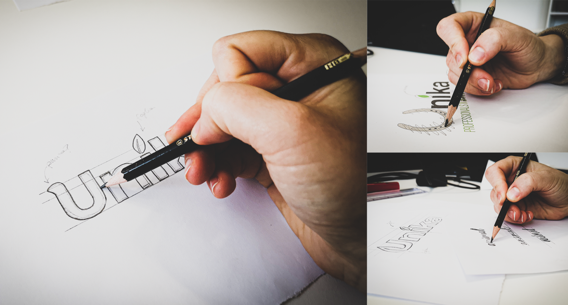
A logo may pop up to your mind suddenly, just like an idea, a creative flair, a spark. But its actual development is a meticulous, “industrial” process. Choosing a proper design, which includes proper proportions and the perfect distance and harmony between the items, takes time. Just as it has taken time to evolve from hand-painted coats of arms to industrialised, mass-produced ones. It may take years, as well as meticulous research and careful development, before a logo can raise awareness of the message it conveys in people’s minds.
![]()
Even 13 years. This is how long it has taken us to come up with Unika’s current logo. It’s not always been an easy path, but it’s been exciting and studded with sleepless nights and bins filled with paper balls!
Then, finally, we got to our current logo. We had to be courageous and overcome our fear, just as everyone aiming at achieving their goals, whether they’re small or big, has always had to. Leaving their safe harbours towards less beaten paths, leading to a new, possible and interesting future: that’s what companies need to do. At Unika, our logo has evolved over time together with our company and has been representing our natural inclination more and more precisely.
2008 was a historic year: in February, Fidel Castro stepped down from his hegemonic position in Cuba. A few months later, the sacred flame of Olympia was burning in the sky of Beijing and announced the beginning of the Olympics, and Barack Obama became the first US Afro-American President. But 2008 will also go down in history as an annus horribilis: it was a black year for Piazza affari, which closed down 50%.
It was a historically significant year of turmoil and big changes. It’s in that time of transformation that Cento Fiori, a family company, established its brand: Linea Unika.
The whole family (Alberto, Gabriela and their daughters, Sara and Selene) was preparing dinner in the kitchen, while brainstorming brand logo ideas. Every detail (graphic design, colours, font) had to represent the mission of the new brand: a made in Italy line of supplements conceived especially for sport horses. Linea Unika and its logo were born that day.
Alberto, an expert in zootechnical nutrition and a businessman ahead of his time, is the actual deus ex machina behind Linea Unika. He aimed at conceiving and manufacturing a single product providing horses with a mix of supplements in a single solution. Ambitious, right? His ambition has led to Fortion 200, a 200 g single-dose product Alberto expertly manufactured himself. A high-quality, all-in-one solution providing all necessary substances for proper equine nutrition. “Una soluzione unica, in un’unica soluzione”, that is a unique, all-in-one solution.
That’s why the brand was called Linea Unika. Graphically, Unika’s “U” was turned into a horseshoe unequivocally representing the company’s core business: horse supplements. The “u” that was turned into a symbol and the “k” would help strengthen the audience’s memory of the brand.
But why is the “k” bigger than the other letters? Because this typographical choice aimed at sending a strong, meaningful message: potassium is fundamental for proper horse nutrition. Moreover, thanks to the tagline “Italian quality” and to the Italian flag, this logo also conveys values of quality, expertise and, in particular, of Made in Italy. And the rest is history! I bet you all have heard about Bill Gates, Paul Allen and Steve Jobs’ garage. Well, at Unika we had our own! ?
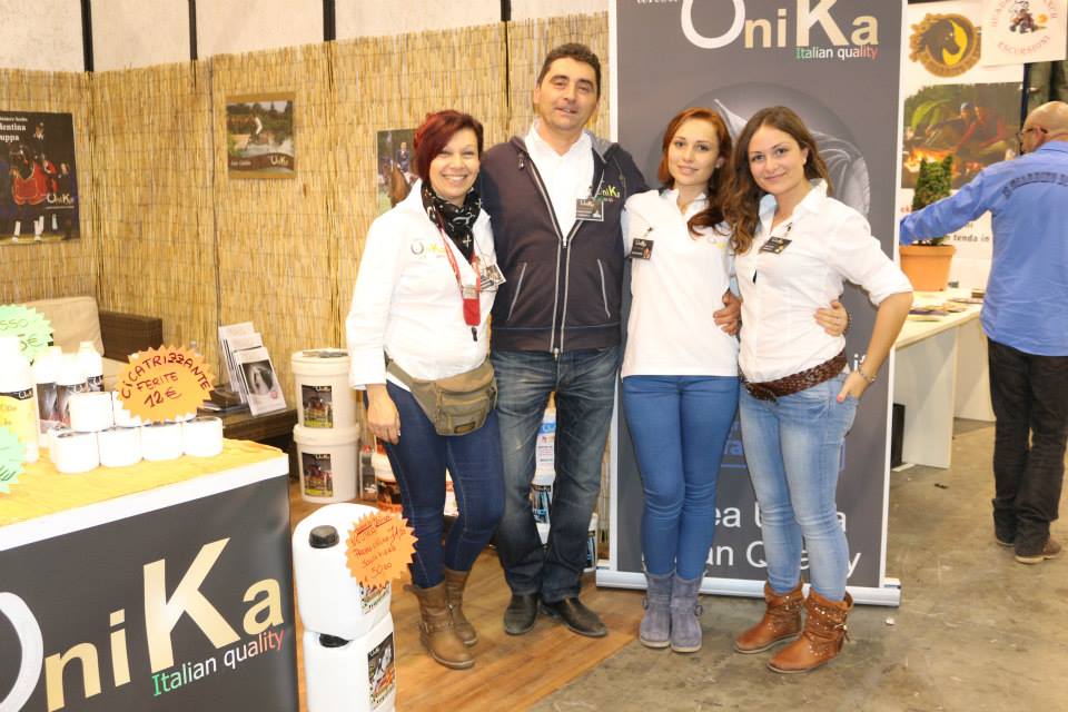
The brand Linea Unika was conceived inside a kitchen, but where has the idea been implemented? Inside a garage of course! That was the hotbed of the development of both our company and logo. Thanks to Alberto and Gabriela’s constant attendance to show jumping shows, the brand became more and more international. They used to constantly travel with their camper to support both riders and their horses. And Linea Unika has travelled with them all over the world to the most important shows.
Unika’s logo has travelled with Alberto and Gabriela as well and, when it crossed the Italian borders, its Italian flag was retired: a second logo was created, which didn’t show the colours of the Italian flag, but still conveyed the quality of Made in Italy products.
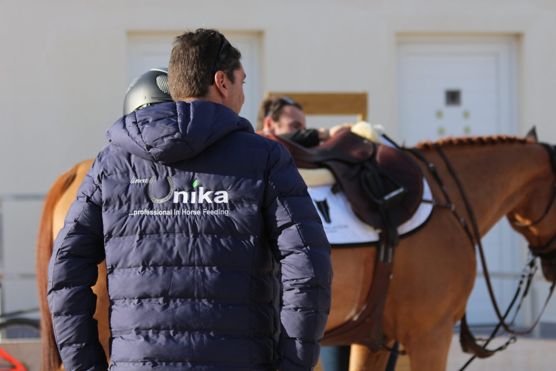
Our logo changed and became monochromatic. The tagline was changed from “Italian quality” to “…professional in Horse Feeding” to underline our expertise in equine nutrition. From now on, our company would not only deal with feed manufacturing, but also with every other aspect of equine nutrition, including custom nutrition advice.
Afterwards, Unika’s logo painted itself in shades of grey and a new element was added to express our deep specialisation in applied phytotherapy: the green leaf.
At that moment, Linea Unika had become an authoritative international market player. Our brand was more and more widely acknowledged in the field of international shows, and professional riders had come to love our products and to establish extraordinary collaborations with our company.
The exposure of specific products for sport horses was increasing and choosing a short, immediate name for our brand was fundamental to get to both riders and influencers. That’s why we chose to remove “linea” from our logo and make it simple, immediate, dynamic.
Unika’s experience and expertise in the fields of nutrition and applied phytotherapy has increased over time: now we don’t only deal with equine nutrition, but also with pet food, which is a skyrocketing sector.
Therefore, we’ve decided to change our tagline from “…professional in Horse Feeding” to “Professionals in animal nutrition”. But we also felt there was a need of updating our logo according to our new vision.
For Unika’s new logo we chose a SANS Serif font (Helvetica Neue Lt Std) that lends it immediate legibility, elegance and neatness. Our new logo is graphically simpler, clearer and more immediate. Unika’s distinctive feature, the leaf, is now one with the letter “U”: it’s a sort of photomorphic desing in which the “U” trait is interrupted and becomes a leaf, which lends the logo the values of unicity, nature and quality. Our new logo shows a letter merging with an image to strike audience’s attention, strengthen its memory of the brand and distinguish it from others, just like the U-horseshoe did.
Concerning colours, choosing grey lends elegance to the logo and conveys the idea of expertise seriousness. Moreover, grey is a neutral colour, which enhances, by contrast, the brightness of the U-leaf “phytoterapic” green.
So, after different restyling phases, Unika’s logo now speaks for itself, with its own voice, and conveys our messages, thoughts and values to our audience.
![]()
Anyone who spends every day around horses knows it well:…
Intestinal parasites are a common and often underestimated problem in…
As September approaches, the quality and nutritional composition of pastures…
As September approaches, the quality and nutritional composition of pastures…
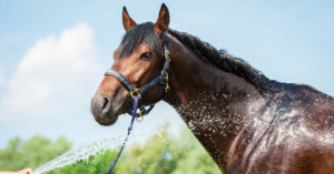
With the arrival of warmer weather, the competition calendar gets…

The importance Assessing your horse’s physical condition and determining whether…